Timeline
May - june (6 weeks)
My role
In this full-cycle design project, I navigated every stage of the design process—from conducting primary and secondary research to defining hypotheses and problems, developing and testing concepts, and ultimately crafting the app's final UI and brand identity.
Tools
Sketch, Figma, InVision, Usability Hub, Miro, Omnigraffle, Procreate
The problem
How can recreational tennis players and people new to the sport get better access to the tennis community in their city and have a more comfortable and enjoyable experience when it comes to finding and booking tennis courts?
The solution
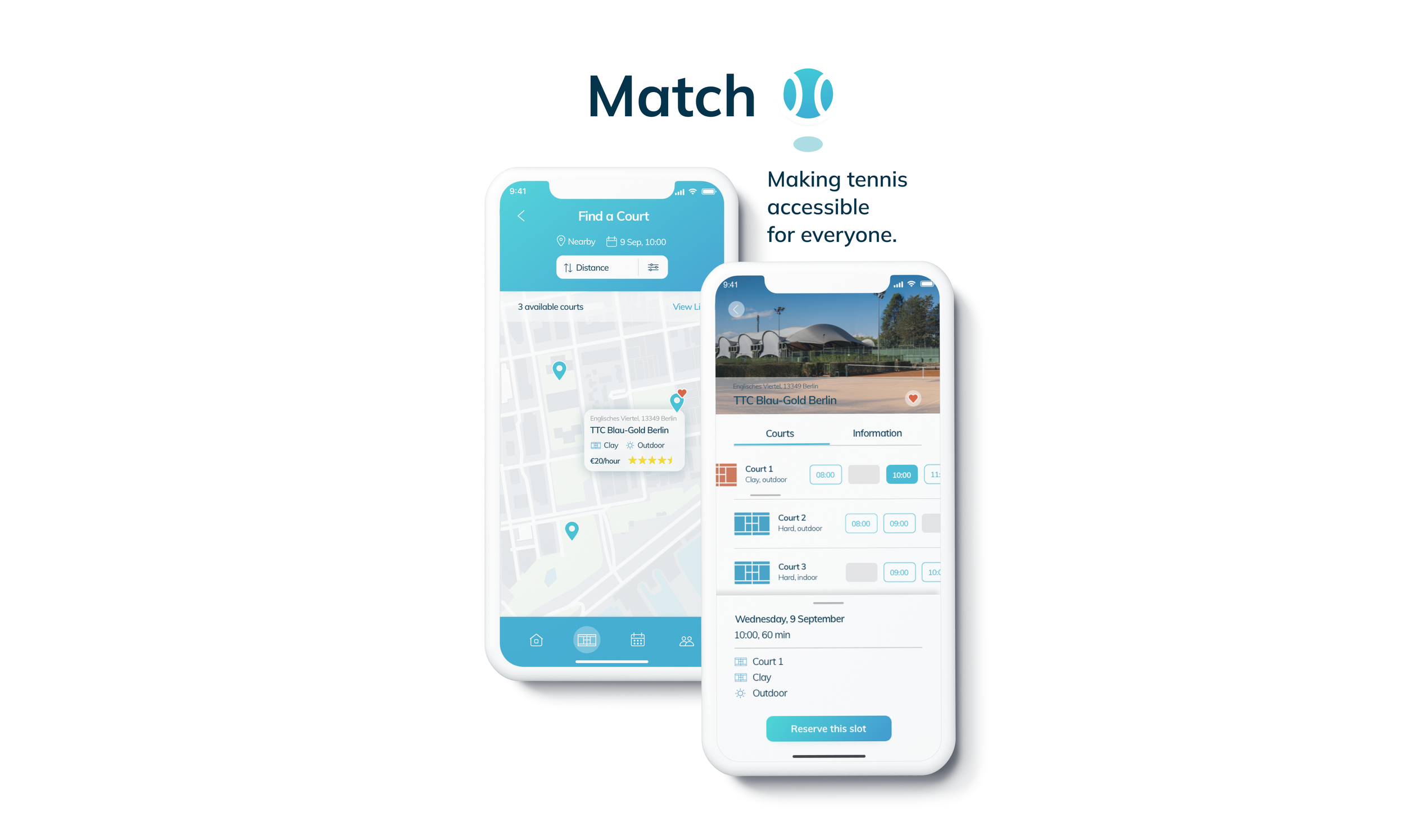
A location-based app for tennis players to create a more fun, accessible and seamless tennis playing and booking experience. Users can access comprehensive and reliable information about tennis facilities, locations and schedules from one place without having to contact facilities separately. All booking transactions and administrative tasks are handled by the app. Tennis clubs benefit from less administrative efforts, higher court utilisation and gaining new players. Moreover, users can get to know other tennis players and find partners with similar experience and skills and engage with a local tennis community.
Background
Tennis is regaining its popularity among young people, having the highest growth rate among “traditional sports” in 2020. The tennis industry has benefited from increasing racket sales and participation rates amid the pandemic. Despite the growing popularity, there is a lack of comprehensive resources for tennis players, especially the ones new to the sport. Finding and booking courts is a complex activity, often involving the consultation of different websites and the need to contact facilities individually. At the same time the nature of the sport is more exclusive compared to most other sports with many tennis clubs having complex policies and requiring high membership fees. This environment excludes people who are enthusiastic about the sport but cannot or don’t want to commit to expensive memberships.
The process
Competitor analysis
I conducted a competitor analysis to discover what solutions to similar problems have already been proposed. Examining competitors from both a business and a product/ UX standpoint, helped me to get a better understanding of the market and to identify underserved opportunities as well as gaps in the experience. While there is no direct competition for a comprehensive mobile tennis app in the German market, I found a couple of websites that aim to address the needs of tennis players. I summarised the key findings of the analysis of one close competitor:
Research approach
My research goal for this project was to understand the experience of tennis players, how they engage with the sport, and what factors impact how and where they find tennis related information. To get a deeper understanding, I conducted secondary research and qualitative user interviews. Moreover, I held one interview with a former board member of a tennis club, which helped me to understand the perspective, rules and requirements of tennis clubs and observe the problem from another very important angle.
User interviews
„I think booking tennis should be as easy and comfortable as booking an uber.“
„Now I am even thinking of something like tinder, just for tennis.“
With a better understanding of the competitive landscape, I moved on with user research following the Research Learning Spiral. I conducted six qualitative in-depth interviews, asking tennis players in and around Berlin about their tennis habits and experiences and their needs and pain points when planning a game. I asked them to walk me through how they complete certain routine tennis-related tasks, such as finding information, booking courts and meeting other players. Knowing that stories often provide valuable context, I encouraged the participants to share some specific recent experiences they had.
Findings
With the insights from the user interviews, I started synthesising and categorising the findings. This helped me to identify patterns, shared experiences as well as needs and pain points. These insights served as the foundation for the project and strongly informed the direction of the design.
Hypotheses
Derived from the identified needs and pain points, I formulated two hypotheses that I aimed to validate with my product:
Recreational tennis players are looking for an easier, faster and more accessible way to find and book tennis courts in their region/ neighbourhood.
Recreational tennis players would like to be part of a network/ community and find others to connect with and meet up to play and train tennis.
User personas
To better communicate my user research findings, I created three user personas representing potential users for the product with similar needs, goals and behaviours. I first drew initial ideas for each persona on Miro and then created the final personas using Sketch
User persona (one out of three)
Defining scope and direction
Once I defined the audience in my personas, I started asking critical questions to identify product requirements, prioritise needs and define the scope of the project before ideating design solutions. In the requirements document I detailed out everything that needed to be considered to bring the product to life, both for the users and also taking business and technical requirements into account.
Filling the gap
The product will help users accomplish their goals by offering a variety of tennis courts with direct and convenient booking options on one place. Player can find the right court and/or the right partner in just a few clicks, based on their needs, location and preferences. No membership fees or binding contracts are required. The app brings tennis facilities with players together to make the sport more fun, inclusive and accessible for everyone. Private tennis clubs can benefit by gaining new players, increase efficiencies by filling empty slots, increasing their brand awareness and eventually become more profitable in the longrun.
Product features
After I gathered all possible requirements for the product, I began prioritising features based on how crucial they are to users and other stakeholders, e.g. tennis clubs. I formulated user stories, each user story reflecting a need that was translated into a feature essential for the first iteration of the product (MVP). BeIow, I listed the user stories and features that were given highest priority. Other non-essential “nice to have” features will be re-evaluated for future iterations.
User flow diagram
With a clear idea of the direction of the product, its features and design, I began to detail out the information architecture. I created user flows for each user story and combined them into a flow chart to show the organisation and hierarchy of content within the app.
Exploratory sketching & rapid prototyping
Once the skeleton of the product was built, I took pen and paper and started moving through first ideas and trying out different design variations for the different user flows. At this stage, I still focused on the main information, content and structure, without getting into any design details yet. To do so, I used te crazy8 concept, dot voted my favorite versions and then turned them into a low-fidelity prototype.
Crazy 8 sketches, 1 minute per sketch
Low-fidelity wireframes for rapid prototyping
Low-fidelity prototype
Usability testing
Test scope
Task scenarios including main search and navigation functions and 3 key user flows:
Explore and find courts
Book courts
Explore and find players
Test goal
The goal of this test was to assess the usability of my location-based tennis app when users interact with it for the first time on mobile. I observed and measured if users understand how to complete key functions of this first low-fidelity prototype, including searching and booking courts and finding other players.
Results synthesis
After conducting the tests, I started articulating and prioritising issues in order to move forward with actionable prototype improvements. I used my testing notes to identify and rank key issues according to Jacob Nielsen’s error severity rating and followed with recommendations on how to solve each problem. I then created a roadmap with actionable and timely product improvements solutions.
Mid-fidelity wireframes
Click images to view wireframe at full size
Moodboard
Once the information architecture and first round of testing was done, I moved on to gather inspiration for the visual direction of the project. I created a moodboard to examine my visual ideas and to stay focused on a creative direction throughout the design process.
Styleguide
With clearer idea of the visual direction for the product, I began working on the style guide, experimenting with different versions of the logo, typefaces, color palettes and images to help me hone the direction of the design. I tested variations of UI elements and components in my wireframes and then implemented my decisions in the final user interface of the app.
Typography
color palette
UI components
Iconography
Imagery and illustration
Wireframe evolution
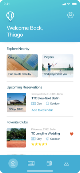
Home screen
Court finder
Player finder
Click images to view wireframe at full size
Final user interface
Responsive design
Click images to view mockups at full size
Mockups
Retrospective
Lessons learned
When I reflect back on my very first completed UX and UI design project, my key take away is: You are the designer, not the user. I chose a topic/ problem that I could well identify myself with, so I already had quite some assumptions from the beginning. I needed to push my assumptions and bias aside and get into observation mood. Testing with real user is really the key in this process.
Next steps
This is only an MVP skretching the surface of what the app could be. I believe that there is a lot more to discover through constant testing and future iterations of the product. Based on user feedback I received, I am planning to building out and testing other aspects of the app, such as the onboarding and sign up flow, profile set up, chat features for players and potentially a tournament section. Furthermore, I am looking to speak to more tennis facilities to better understand the business requirements and vision in regards to such a product.
What went well
I completed the project including all deliverables within a set timeline of a bit over a month. The research, observation, usability testing, and user feedback early on in the design process helped significantly to understand how the product could best serve the user and to clearly define the scope and direction of the project. The user personas served as a reminder throughout the process to always keep in mind who I am designing for. I am also pleased with the visual language and concept that I managed to apply consistently across the app while remaining faithful to the foundationI established during the UX phase. Moreover, it was very rewarding to hear from users would really benefit from such an app and that it would make their tennis-playing experience much better, easier and more enjoyable.


