My role
UX and UI Design of iOS and Android native apps
Timeline
July (2.5 weeks)
Tools
Sketch, InVision, Pen and Paper
Project objectives
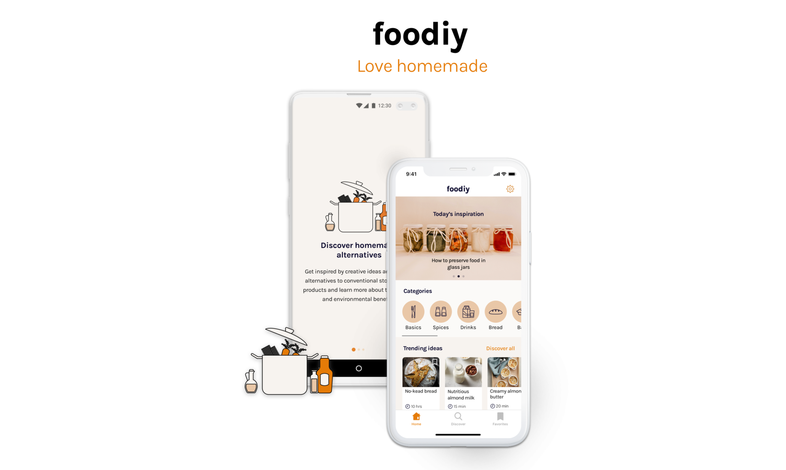
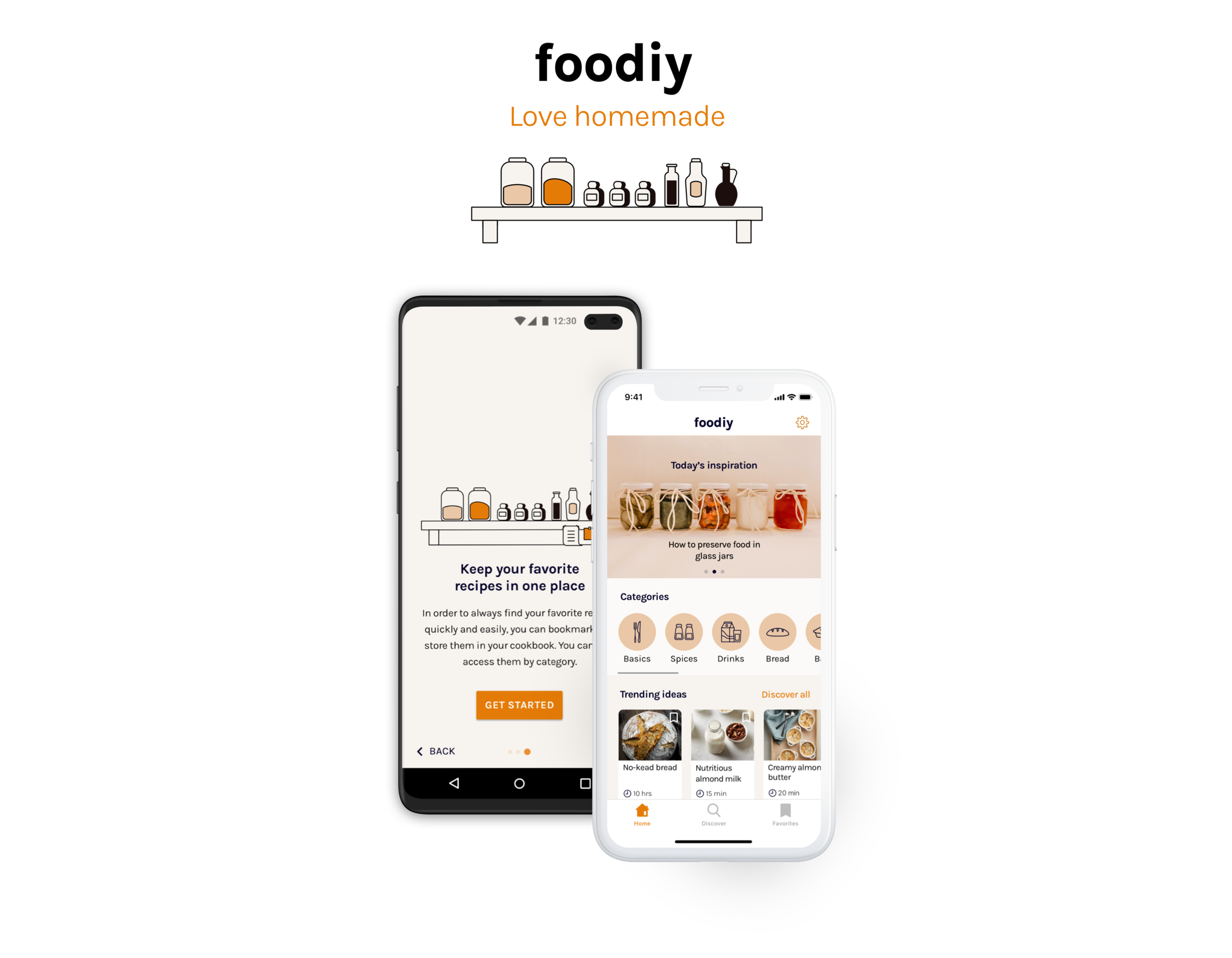
The app foodiy is a project developed as part of a UI/UX design course I attended in 2021. The project’s challenge was to design a native app for both Android and iOS devices. The task was to follow both system guidelines, the Human Interface Guidelines for iOS and the Material Design Guidelines for Android, closely throughout the entire design process.
What is foodiy?
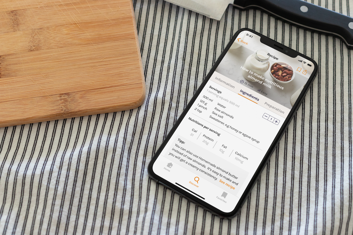
foodiy is an app that provides creative ideas and healthy alternatives to conventional store-bought products that can easily be made by anyone at home and are better for the health, environment and even the wallet.
Context
Many ready-made products from the supermarket contain unhealthy additives. Even the most basic ones like vegetable stock and granola. While consumers are getting increasingly conscious about their own health and their environment, they are looking for healthier and more sustainable choices. The app provides useful tips and recipes and educates the user about the health and environmental benefits of home made products. There are a couple of apps for more sustainable living and eating in the market. However, there is no app specifically focusing on how to make kitchen essentials and ingredients from scratch.
Users
Users are health-conscious consumers, who are looking for healthier alternatives and also find the time and have interest to understand more about the benefits of homemade products.
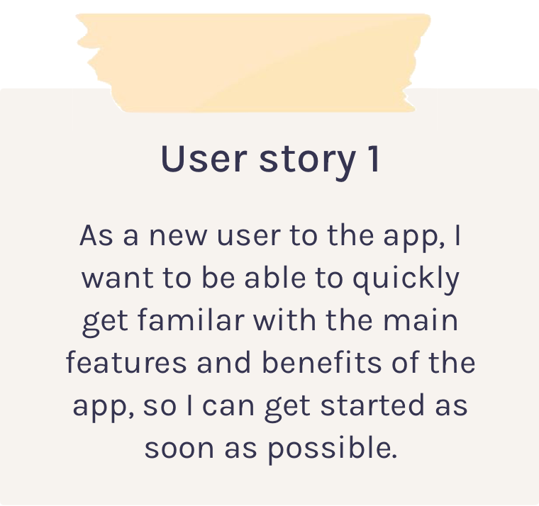
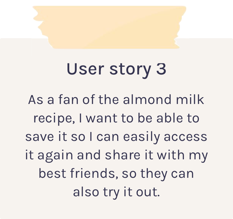
User stories
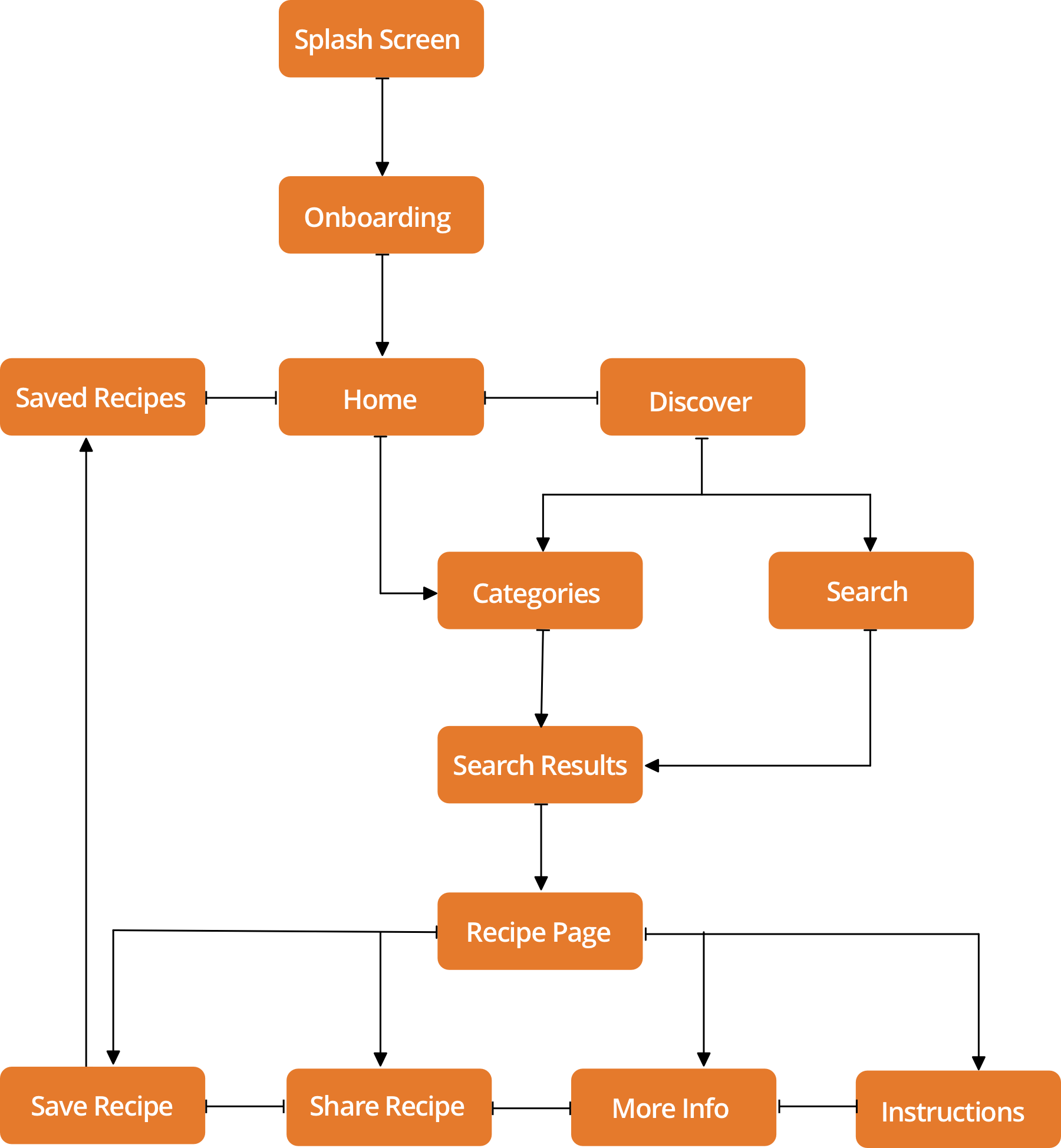
User flow diagram
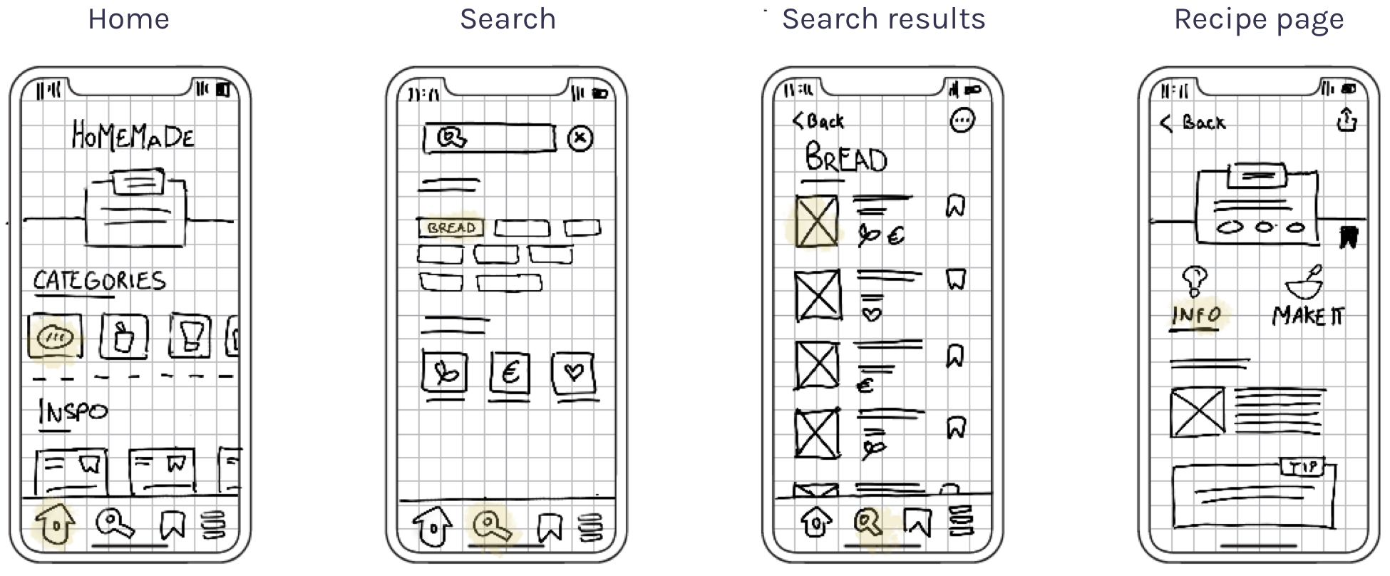
Low-fidelity wireframes
Mid-fidelity wireframes
Android
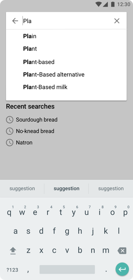
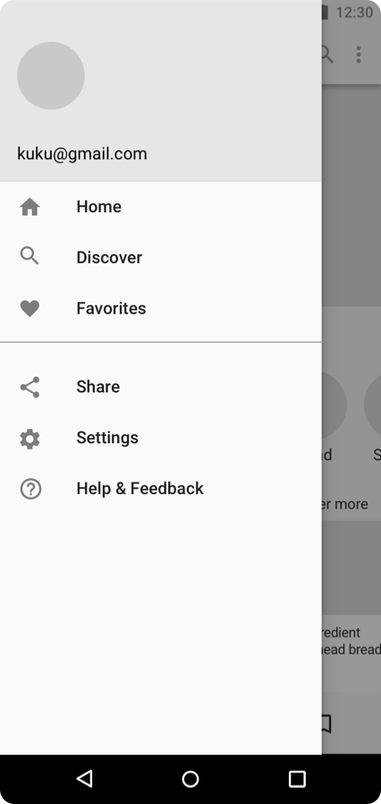
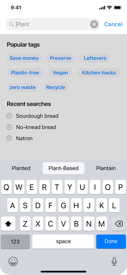
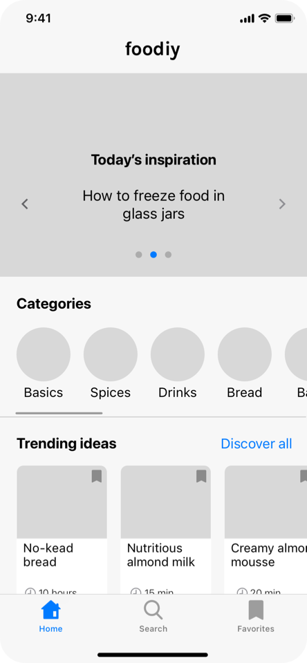
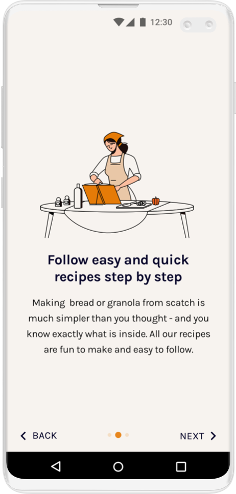
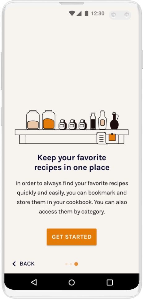
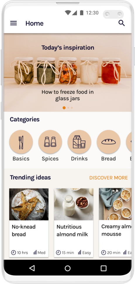
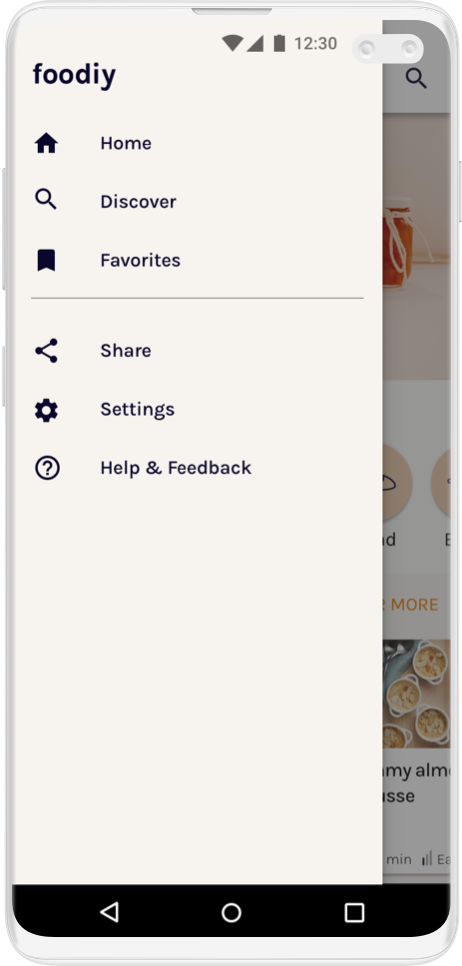
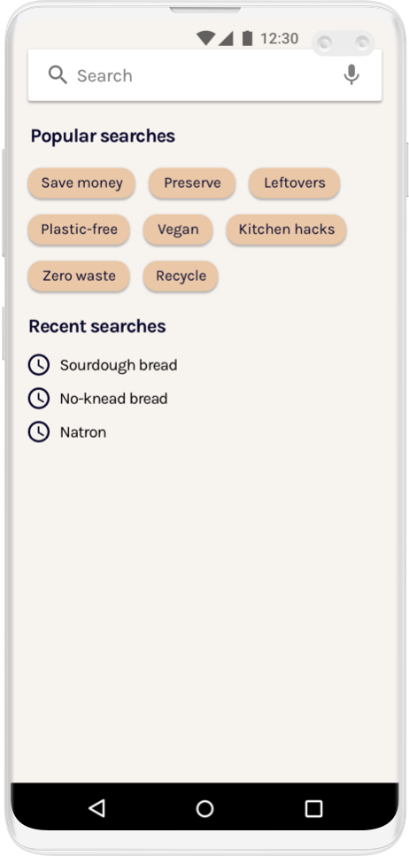
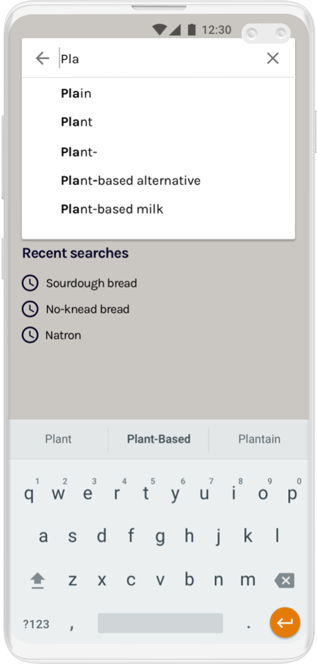
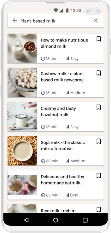
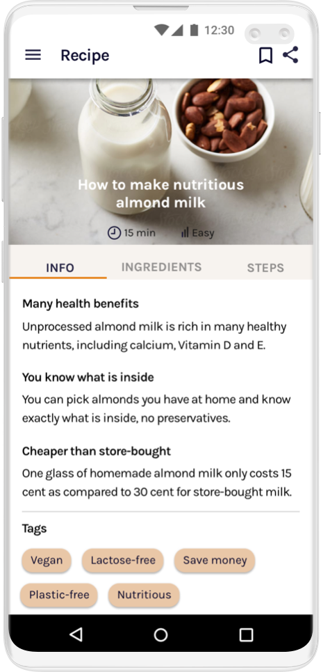
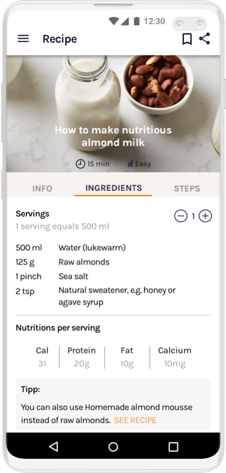
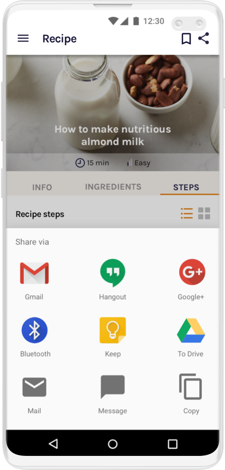
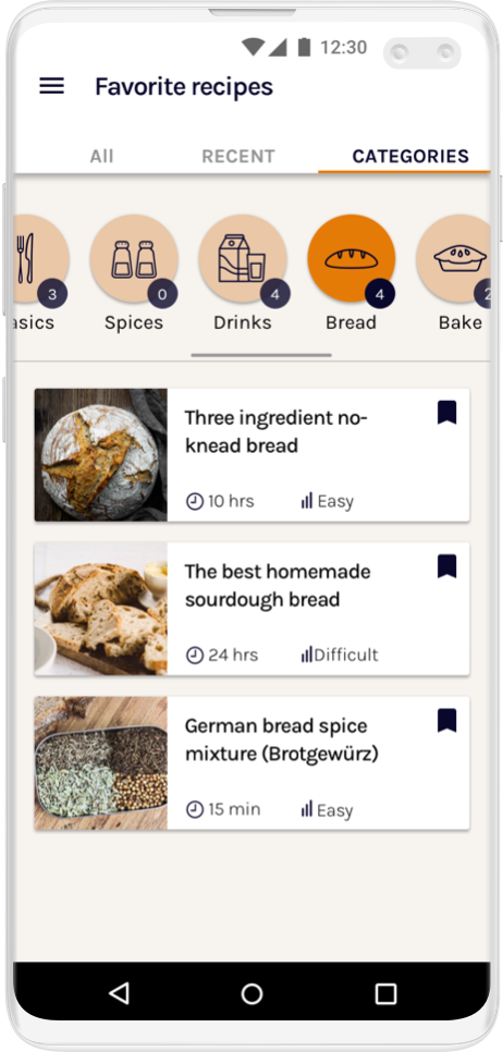
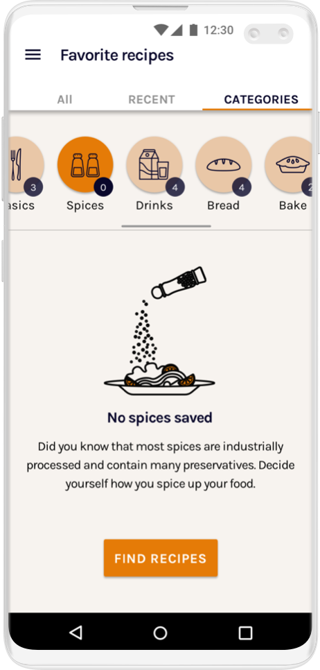
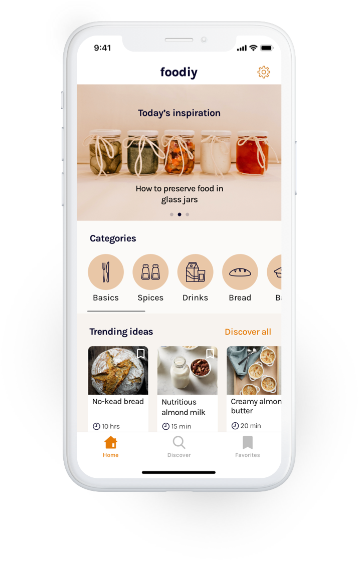
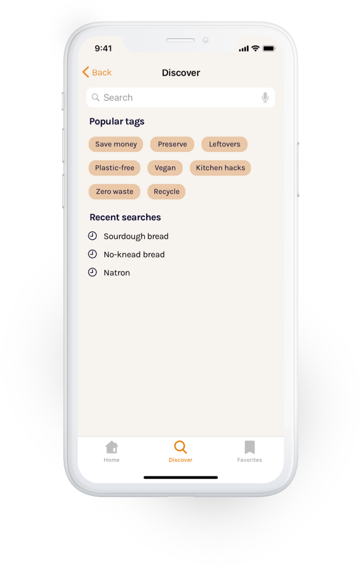
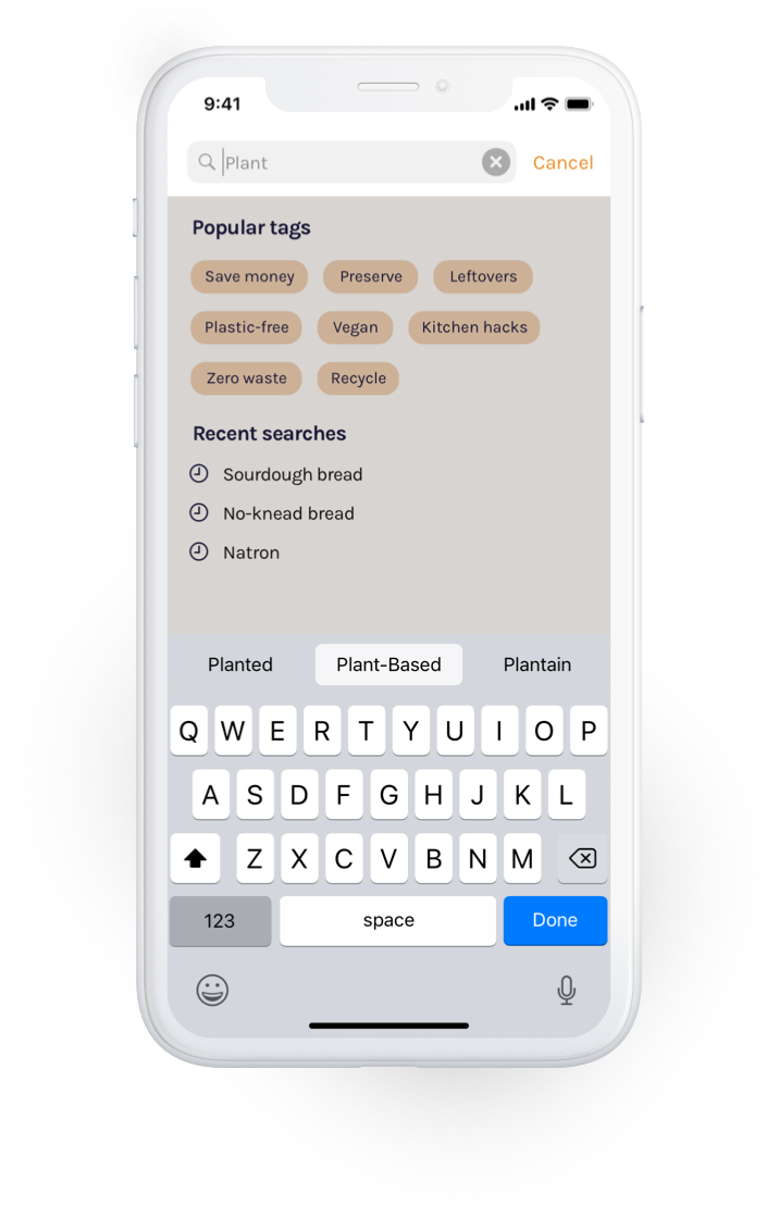
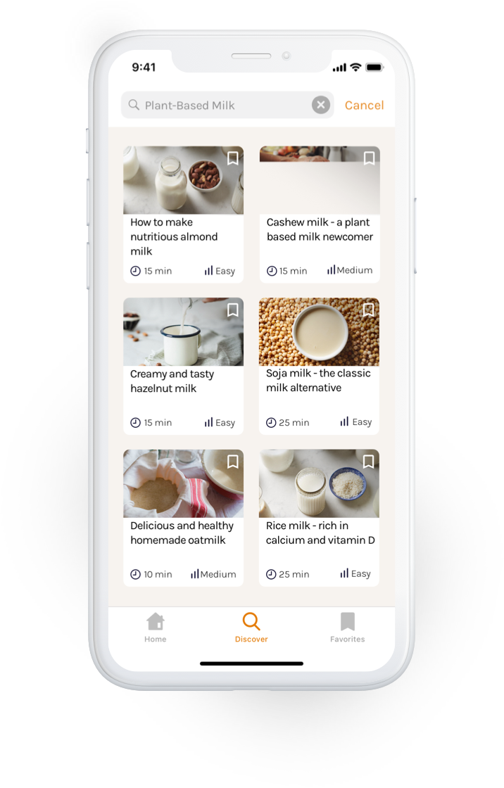
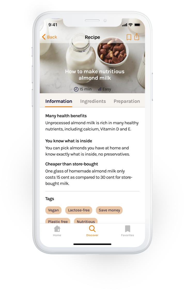
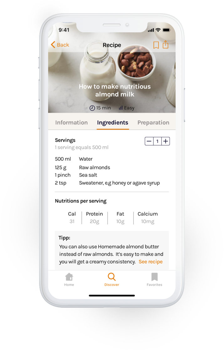
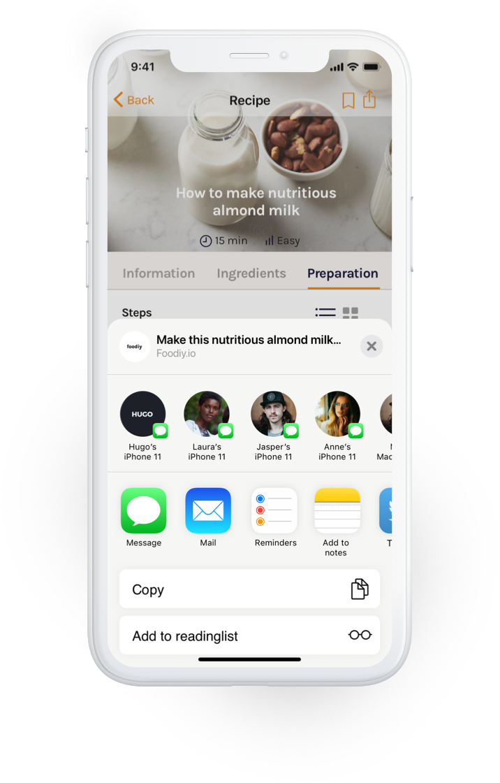
With my app structure and first sketched ideas in mind, I started designing the screens by pulling common design components and elements from Human Interface and Material Design guidelines. I used native mobile design patterns, taking advantage of both platform’s features to provide a better experience to native users. I highlighted key differences in terms of app architecture, navigation patterns, general styling and UI controls.
iOS
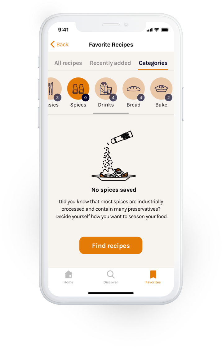
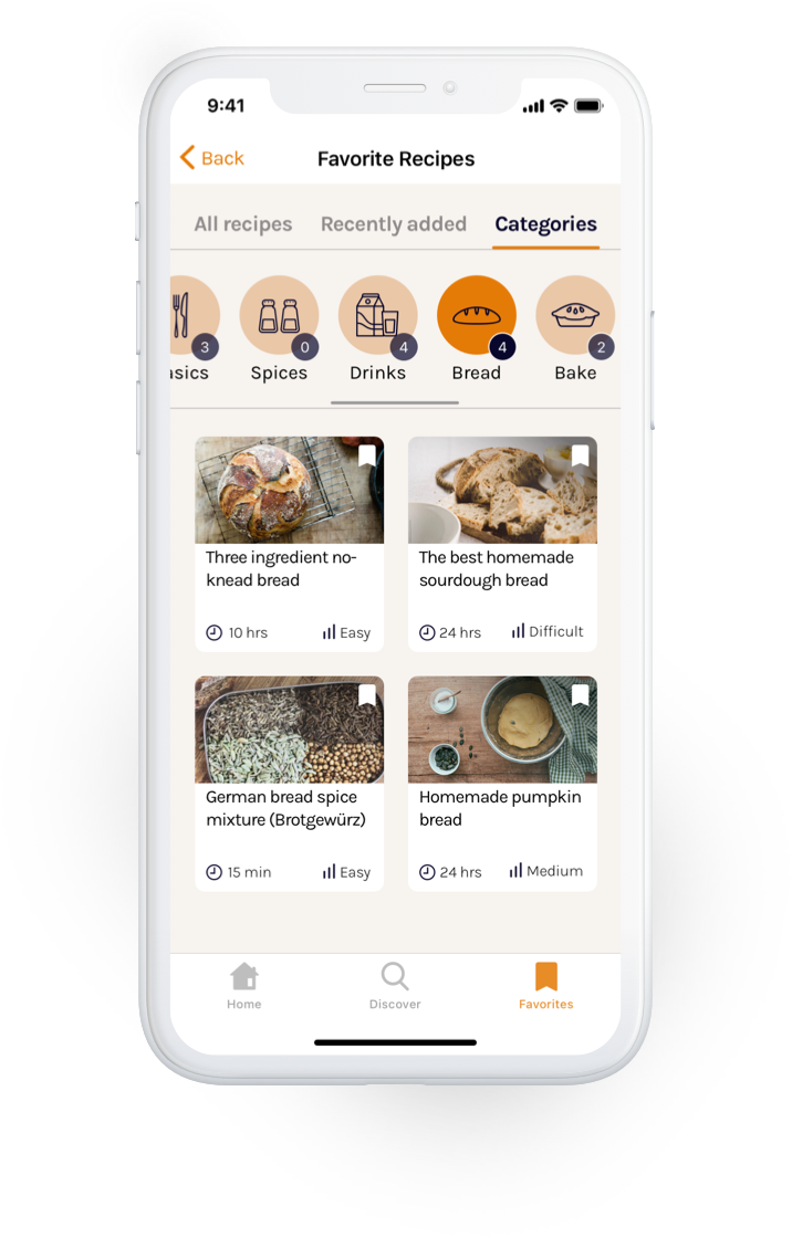
Android uses a drawer menu tucked away inside a hamburger menu, while iOS uses a tab bar for its main navigation. Android devices have a built in back button we use to return to a previous state. iOS, on the other hand, places the back button in the top nav bar. iOS uses flat design for styling elements like buttons, while Android works in a 3D environment, thus elements are affected by light and depth and cast shadows.
Typography
Colors
Icons and illustrations
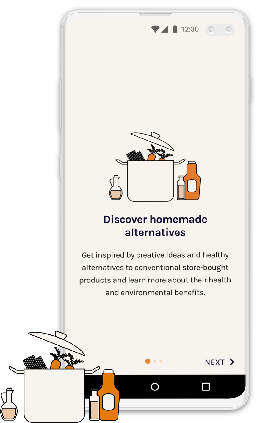
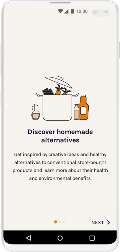
Onboarding illustrations¹
1. Illustrations by DrawKit
Food category icons
Feedback implementation
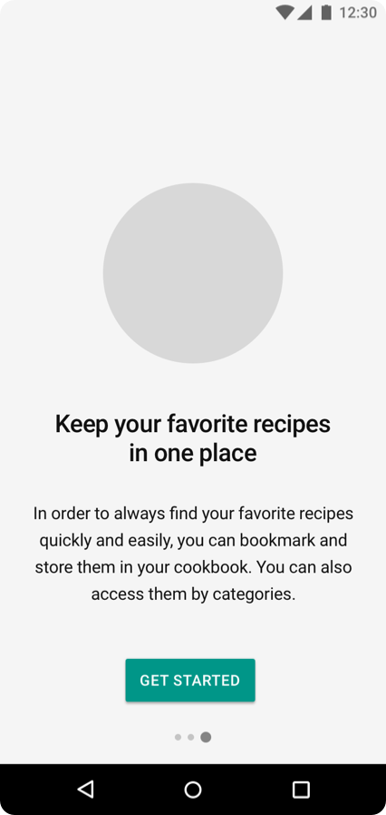
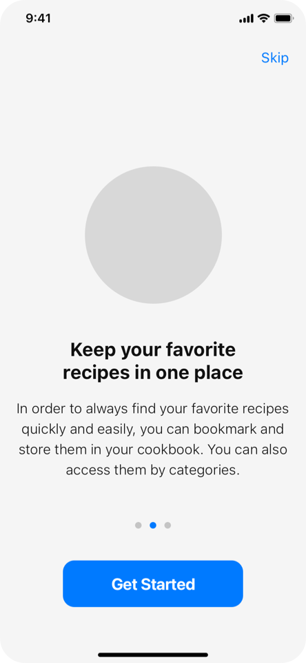
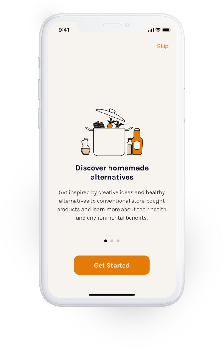
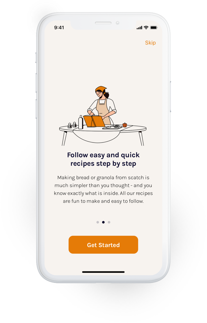
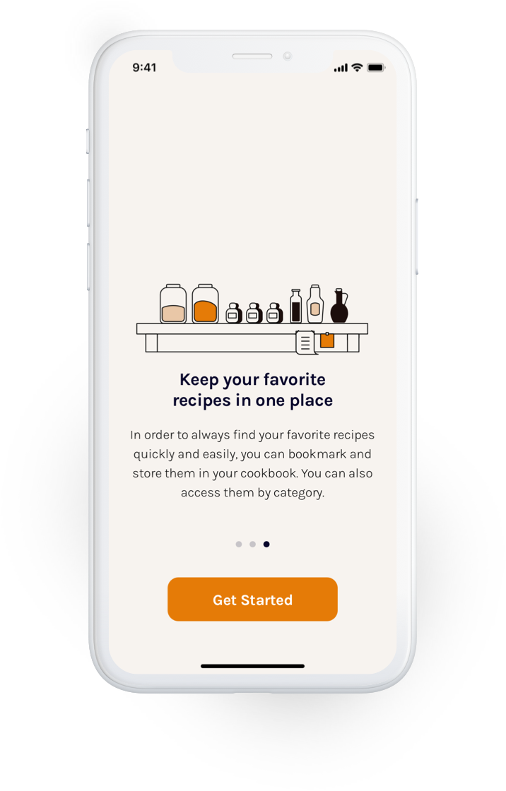
I improved the onboarding experience and added a “get started” button on all onboarding screens in addition to the skip button, so that users can choose whether to walk through the onboarding screens, skip individual ones or get started right away.
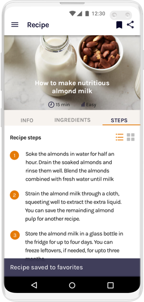
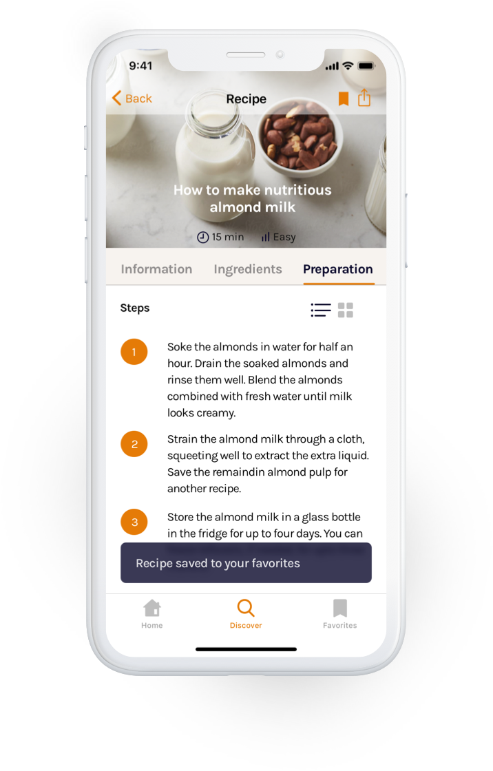
A subtle snackbar appears on the bottom of the screen to let users know that they have successfully saved a recipe to their favorites. The element is not distracting and disappears by itself after a short time.
Testing objectives
I created a prototype of my UI design for both iOS and Android and shared them with native users of each operating system. The testers had the chance to put themselves into the shoes of the user and run through the entire app. Prototyping and testing the user interface in the final stages was a great way to determine what was already working well and what still needed to be adjusted and tweaked in terms of design. In the section below are two examples of user feedback, which I implemented from the test.
