A user-centered redesign of the eCademy e-learning app for enhanced navigation and engagement
Company and product
eCademy is an e-learning provider dedicated to supporting trainees in technical professions. The platform offers interactive, skill-enhancing content tailored for hands-on learners who spend most of their time in practical settings with machines. The app is accessible on both desktop and mobile, designed to supplement real-world training with targeted traineeship content and exam preparation.
Solution
The redesigned app features a cleaner, streamlined user interface that enables trainees to dive directly into their learning with minimal friction. Updates include progress trackers on the home screen providing users with a clear standing in their learning journey as well as enhanced navigation allowing users to navigate content more efficiently with clear focus on learning goals.
Team and my role
This project was a collaborative effort within a cross-functional product team that included a product manager, developers, content stakeholders, and myself as the product designer. We worked closely together throughout the project, to collectively generate ideas that shaped the direction of the product and ensure that design choices aligned with both user needs and technical feasibility.
My role
As the Product Designer I was leading entire design process, from initial discovery and ideation through prototyping and final designs.
Team
Product Manager, Product Designer, Developers, Instructional Designer and Content Manager
Understanding the problem
The existing app experience presented several usability obstacles that hindered trainees from engaging with content and progressing through their learning journey:
Cluttered UI, offering too many options.
Excessive scrolling to find relevant content, resulting in time consuming navigation.
Lack of clear progression indicators, leaving users unsure of where to continue learning.
Too many images making it difficult for users to focus on core content and tasks.
Data underlined these problems:
31% of learners dropped off after login.
Only 16% started or continued with their learning journey.
„I am lost when I enter the app and overwhelmed by all the options“
„I am confused and don’t know where to continue my learning“
How might we
Improve orientation
Reducing the need for excessive scrolling, allowing users to quickly access the information they need.
Help learners access content easily and quickly
Allowing users to quickly access the information they need.
Reduce choice and clutter
Simplifying the app interface to help trainees focus on the most relevant learning content.
Decrease cognitive load
Balancing the use of images to engage users without overstimulating them or distracting from core content.
What we learned from a survey
Key insights:
Main navigation challenges include missing shortcuts to content
Users find the amount of visual content overwhelming
Users want to see their progress at glance
To gain insights into the current learning experience, the Product Manager and I implemented an in-app survey. The goal was to identify specific pain points and gather feedback directly from trainees about their interactions with the app. On a scale from 1-5, the average answers provided by learners were:
Diving deeper into pain points: heatmap and card sorting
To better understand how users interact with the app, I used Fullstory to identify specific drop-off points, usage and navigation patterns. I also reviewed heatmaps to visualize user interactions and discovered that a significant amount of content was being missed because it was located further down the page. Additionally, I conducted a card sorting activity to better understand how users intuitively organize content and prioritize information. I asked trainees to group various app elements and content categories in a way that felt logical to them. The insights provided valuable input on how to structure the app’s navigation and content to move forward with ideation as a next step.
Improved information architecture
Based on the research findings from the card sorting activity, usage insights as as well as Mixpanel and Fullstory data, I created a new information architecture for the app. The redesigned Information architecture focused on simplifying the navigation paths, grouping related content logically and prioritizing access to essential sections such as the home area, progress tracking and a content library - a new section in the app where all relevant content and essential learning resources could be easily and found including a search functionality . Overall, the aim was to reduce cognitive load and make it easier for users to find what they needed through a clearer hierarchy and minimal effort.
From ideas to wireframes
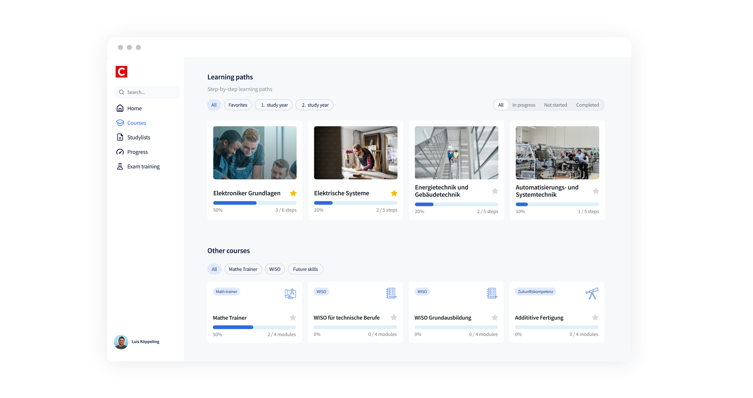
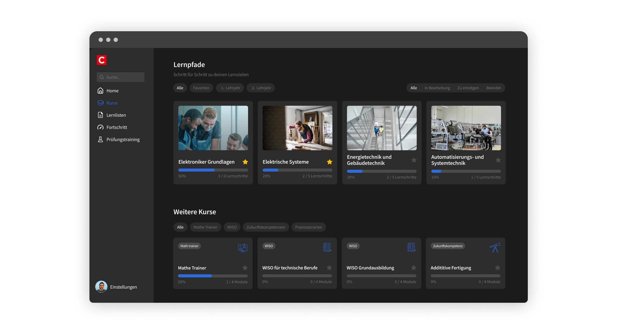
To bring concepts to life, I created wireframes, progressing from low to high fidelity, for the app’s home area. The focus was on simplifying navigation and enhancing user guidance, centered on bringing users back into their learning environment and encouraging them to seamlessly continue where they left off. I mapped out key steps in the user journey, such as resuming learning by clicking on a module and giving learners the option to explore different learning paths. as well as navigating to the content library for additional learning resources. A key navigation and orientation improvement was the new side bar to facilitate quicker access to additional learning resources (content library) which was previously located very far down on the home page.
Tested the new concept with learners
Trainees that use and test the eCademy app
To validate these ideas, I conducted a mix of moderated remote and on-site user testing sessions with trainees. Users were asked to navigate through a prototype and complete common tasks, such as resuming a module or browsing the content library to find other content that equips them with additional knowledge and skills.
The on-site tests, conducted at trainees' workplaces, provided valuable insights into their work environment and practical context. Observing how trainees use the app in their day-to-day setting helped uncover additional pain points and opportunities to further align the design with their needs.
Wording of content library not clear
Many users expressed confusion about the purpose of the content library and referred to their familiarity with courses instead.
Enhanced navigation with side bar
Users preferred the sidebar navigation over top bar navigation for better orientation and being able to access key content quicker.
Focus on what is important now
Users didn’t find it valuable to view all available learning paths on the home area . They preferred to have additional content recommended to them based on their current learning path.
See learning progress at glance
Users appreciated seeing an overall performance and progress indicator on the startpage to see where they stand. They intuitively clicked on the widgets for a more detailed performance overview.
Validation and moving forward
To improve navigation, I expanded the sidebar with more logically grouped items for easier access. The “Courses” section now consolidates learning paths and other courses, making course-related content easier to find. I also added a "Recommended for You" section on the start page, offering personalized content relevant to each user’s current path. These can entail shorter modules and learning snippets from other courses that are more easily digestible but still valuable for the learning context, for example when the user doesn’t have the time to complete a full module, while he or she is at practical training in the factory and has to learn something quickly.
Final designs
Measuring impact
The new design was rolled out to 800 test users/ trainees from different companies, who engaged with it and provided us with feedback. This initial testing phase allowed us to refine the experience based on real user insights and first data. The improved metrics revealed that the changes in navigation, content accessibility, and the more engaging start page successfully encourage users to stay in the app and continue their learning journey.
Next steps
The next step was to collect more data on usage patterns, gain feedback from users and further optimize the design before a full rollout to all users. With each iteration, we aim to create user value and gain quantitative and qualitative feedback to further refine designs.
To demonstrate our iterative process, this video shows a first iteration of how the side bar navigation, top bar with progress tracker and “Continue Learning” cards were implemented.


